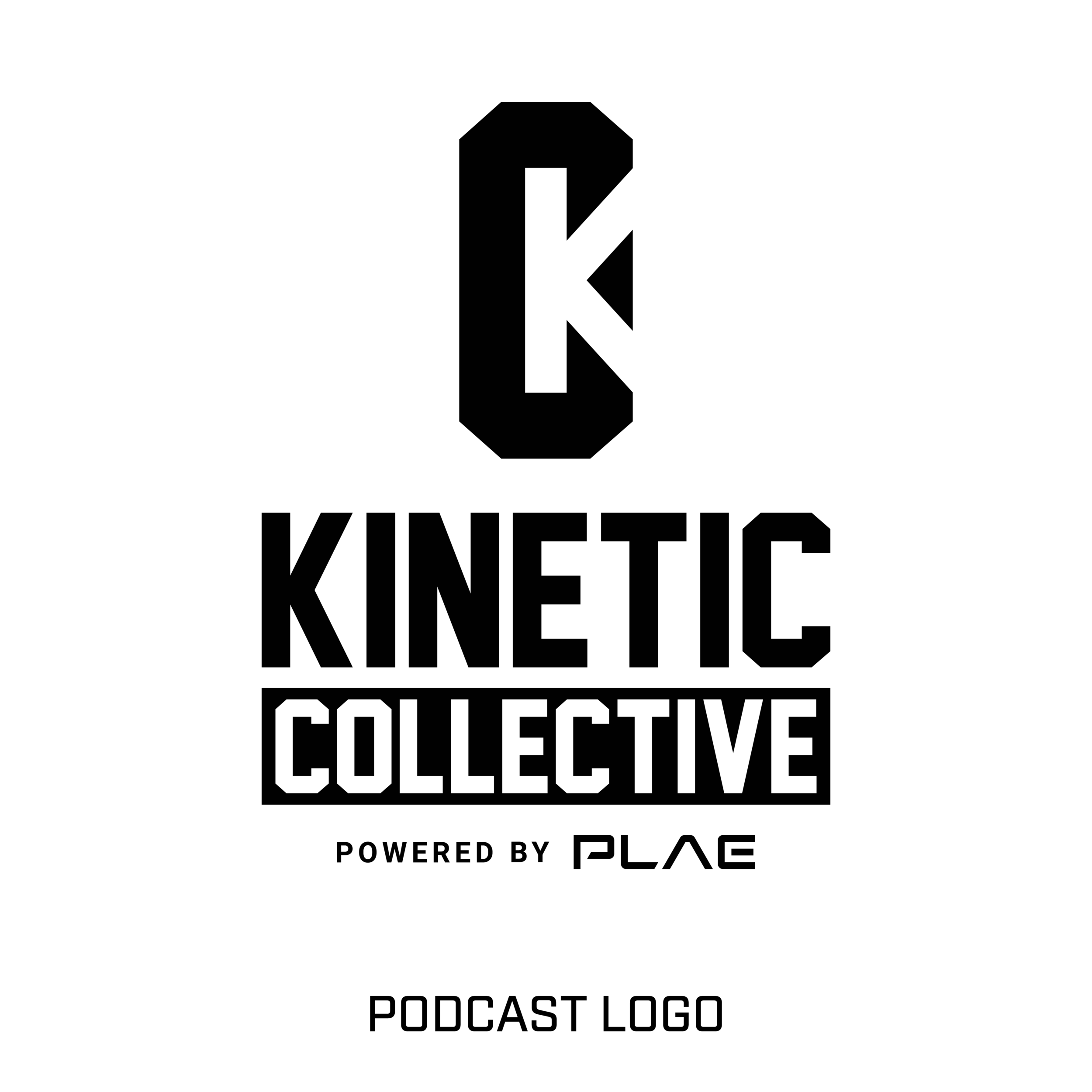

PLAE is a worldwide leader in athletic flooring and turf. Icreated a wide variety of pieces for PLAE, including product logos, packaging, apparel graphics, font creation, brochures, social media graphics, and more.
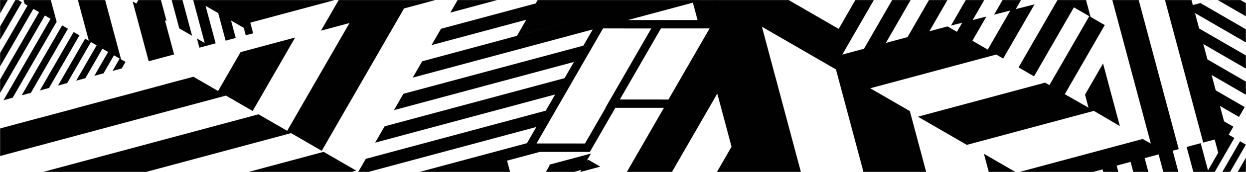
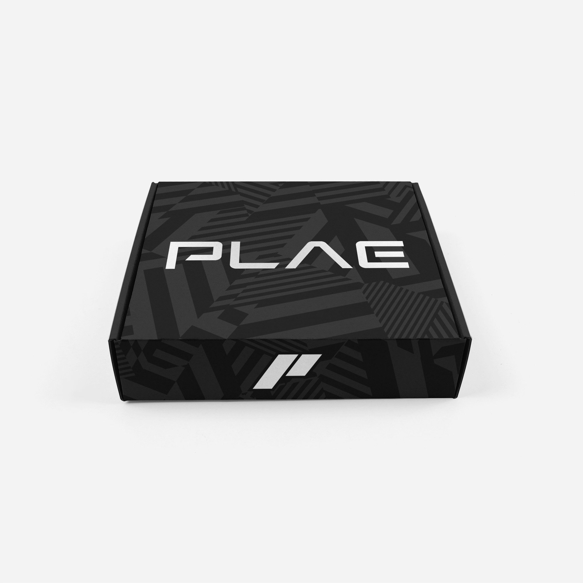
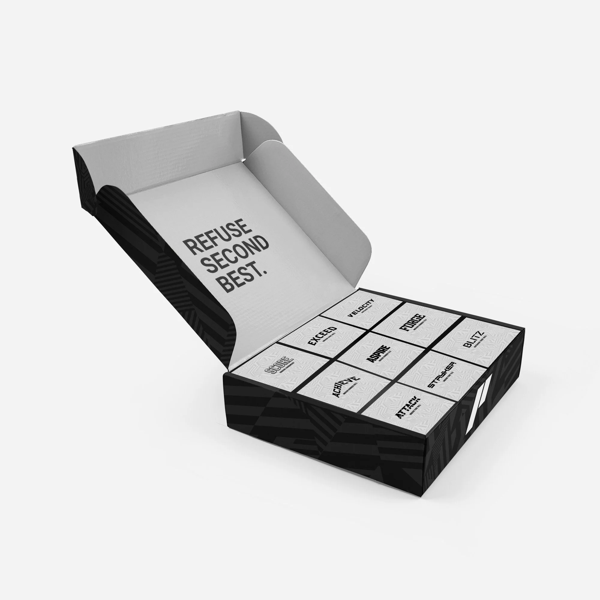
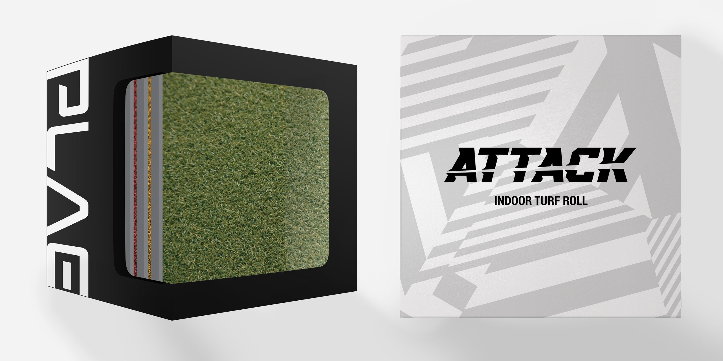
PLAE was looking to redefine their visual presence across all media. Looking to create a clean aesthetic using largely black and white with small pops of color, we used a variety of design elements, such as a custom dazzle camouflage seamless pattern based on the 60 degree angles used in PLAE’s logos, on the packaging sent to architecture firms containing flooring samples. The concept was to stand out while blending in, like PLAE’s superior products.
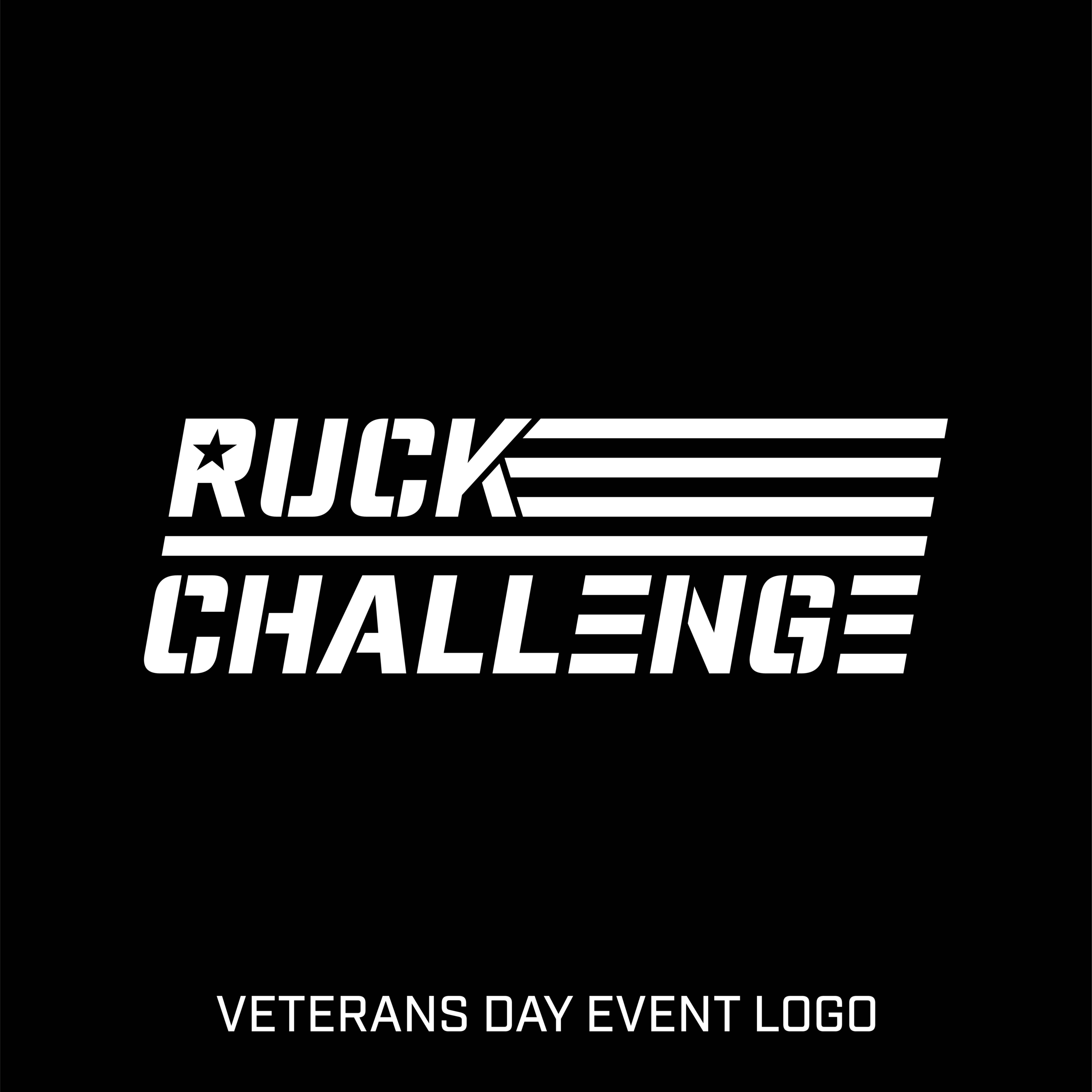
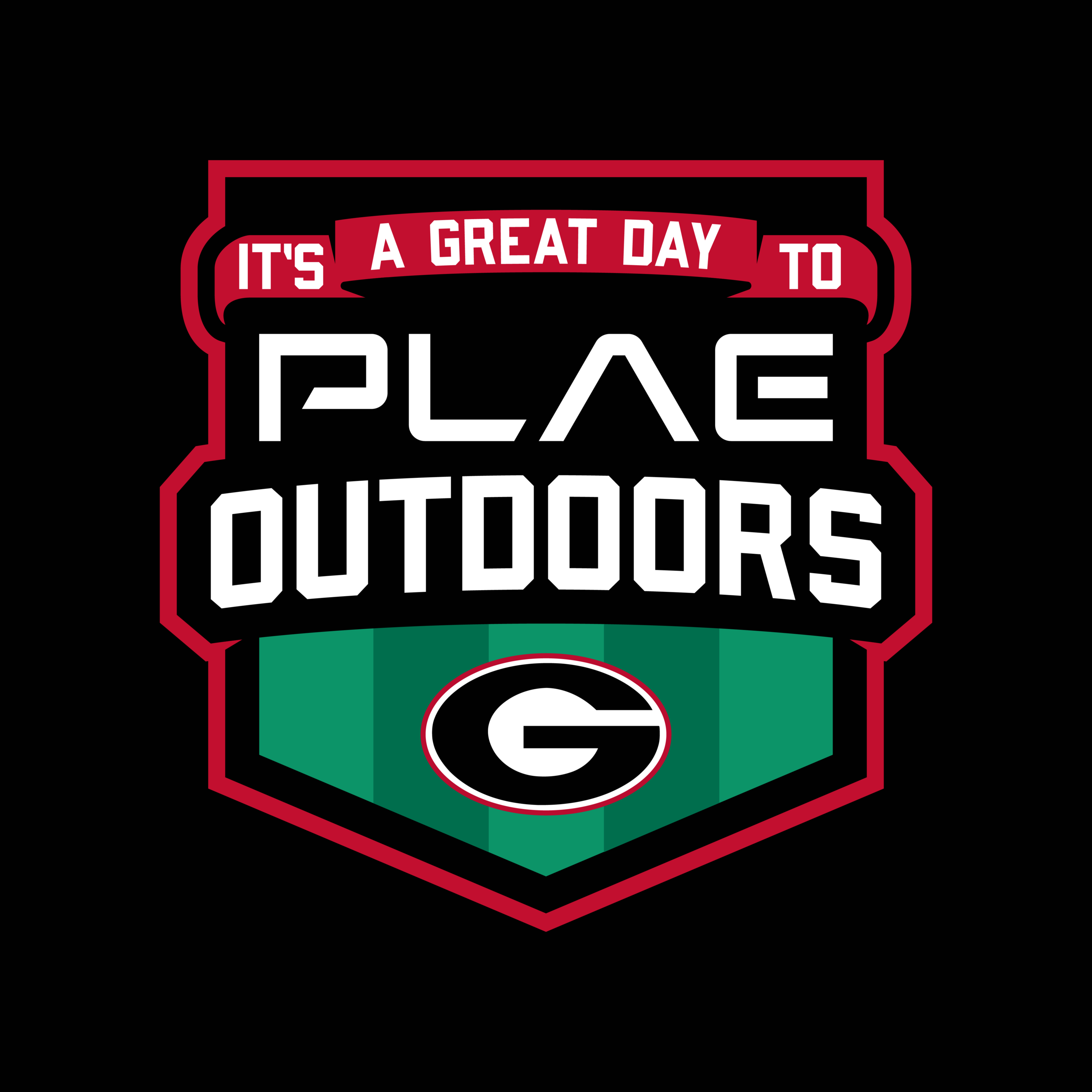
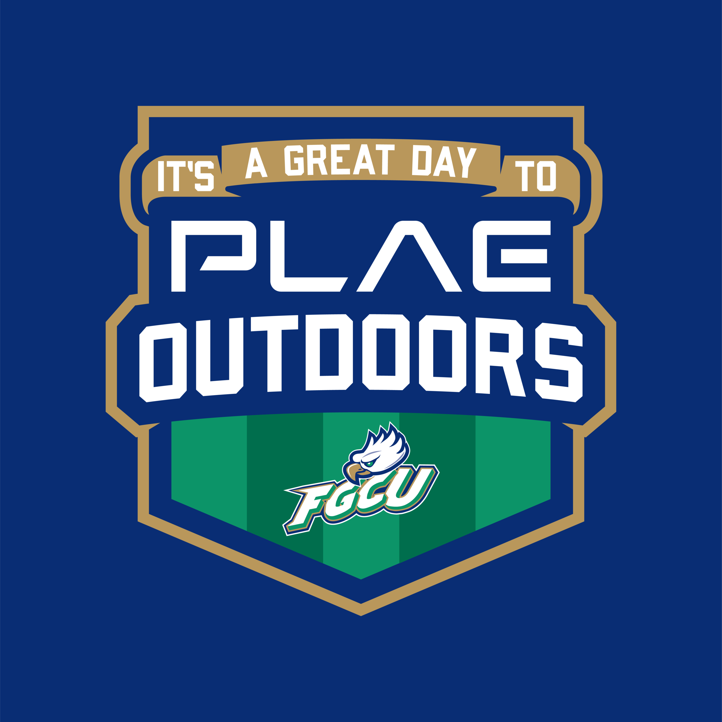
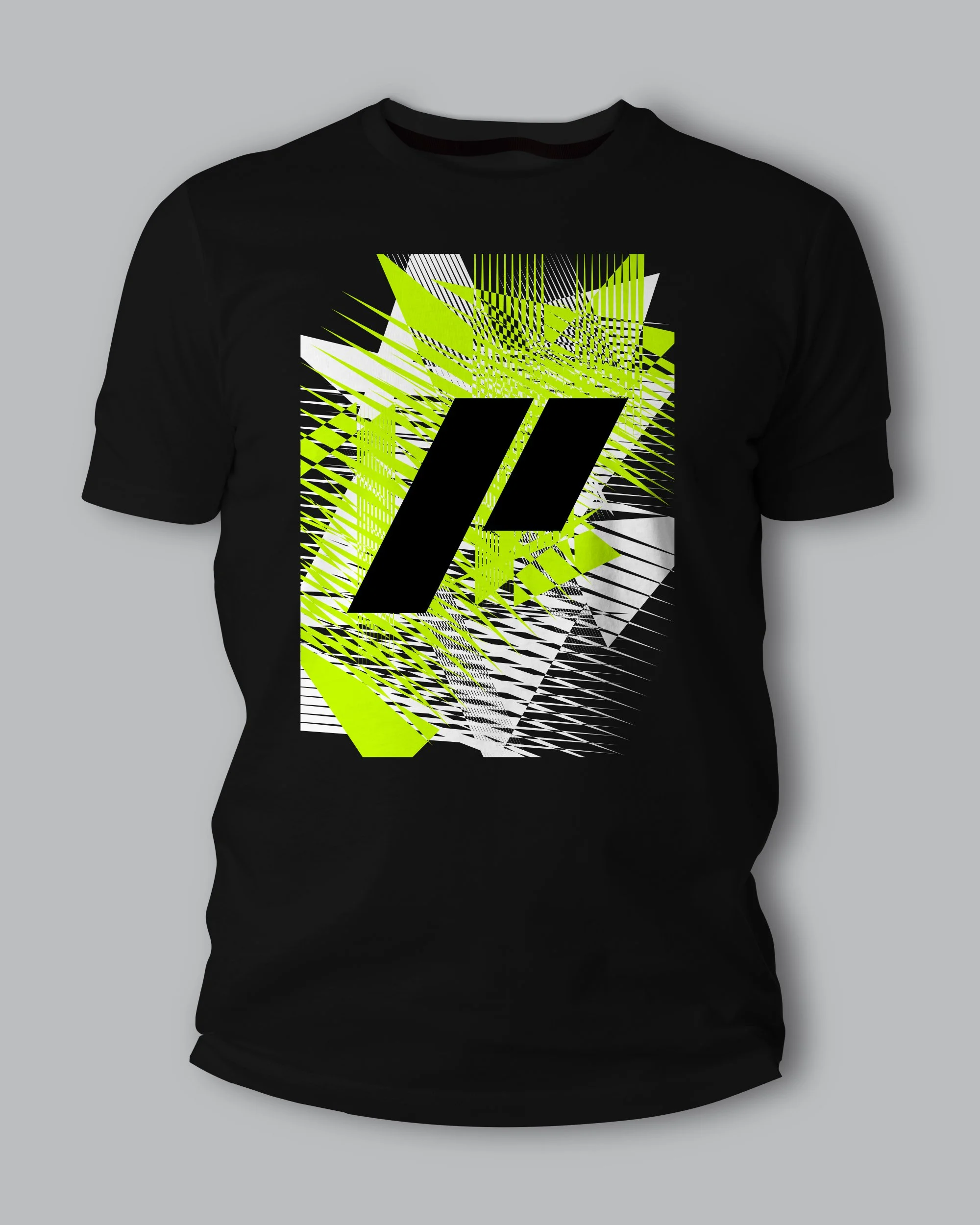
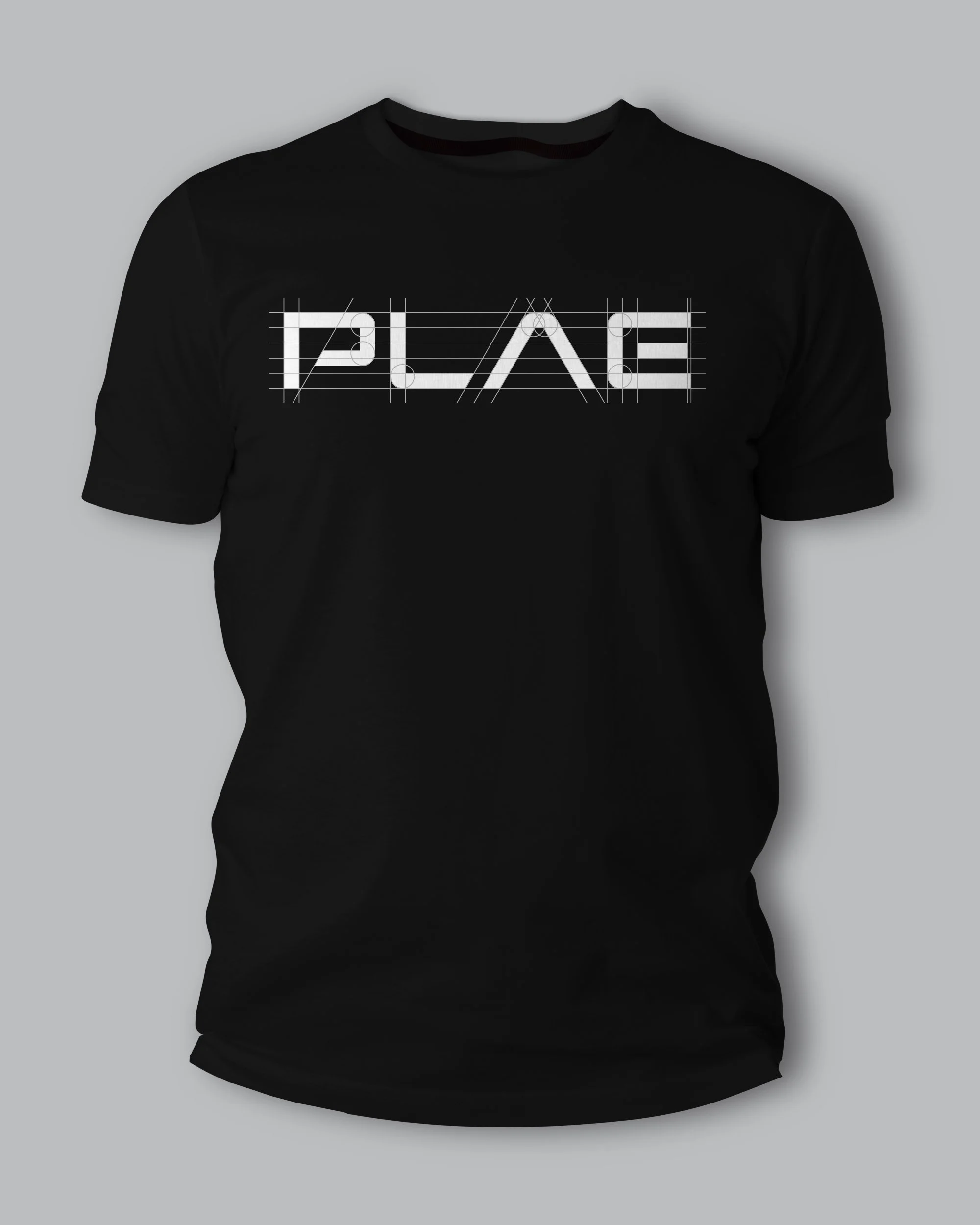
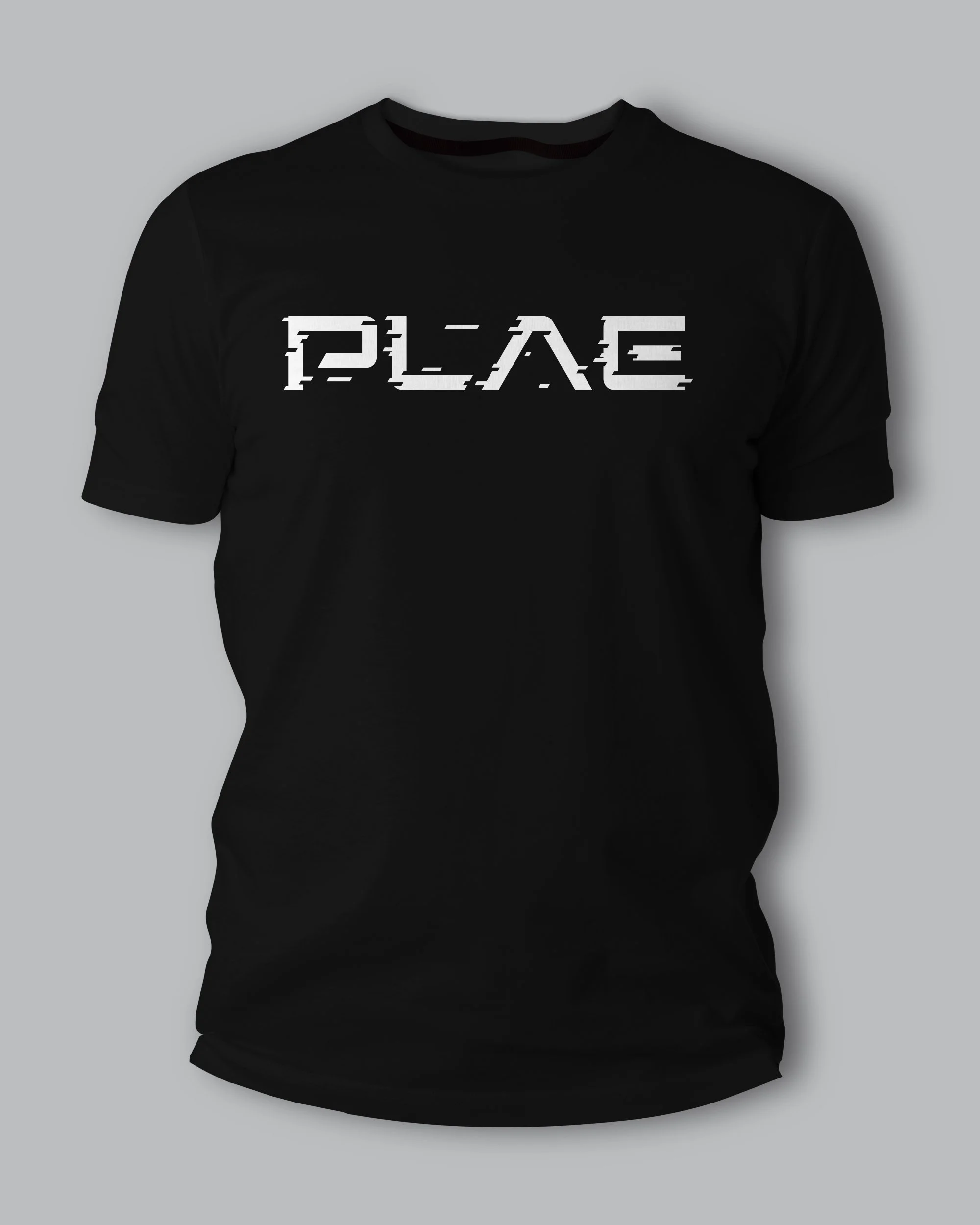
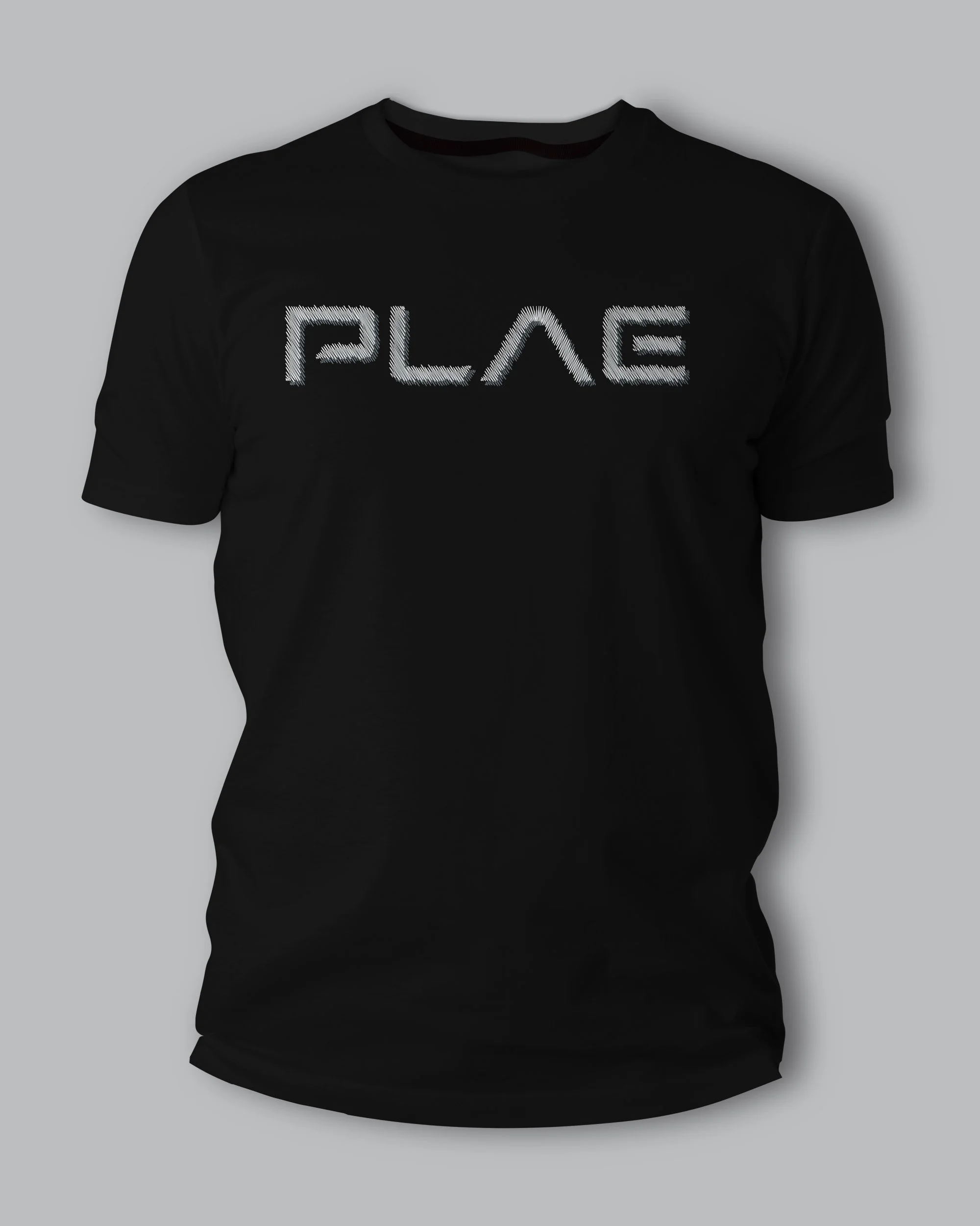
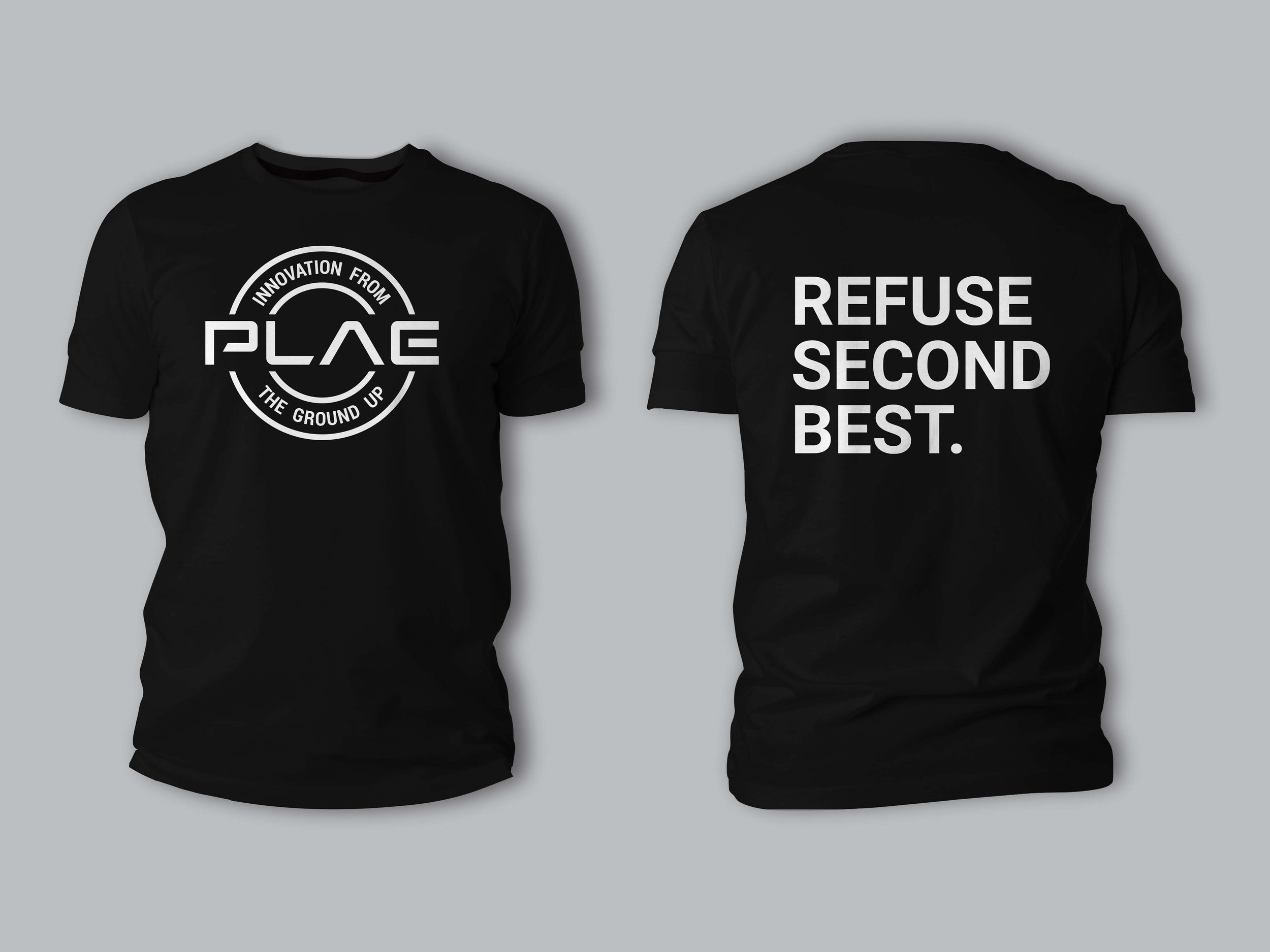
Another key component was in apparel design. PLAE gives out thousands of shirts a year to clients, athletes, partners, and employees. Most of the existing shirts were simply the PLAE logo in white on various colored tees. Several badges were created to go on shirts, as well as “remixes” to the PLAE logo to make the be more interesting to recipients. Team branded designs were also created for certain clients using PLAE’s outdoor division’s tagline.
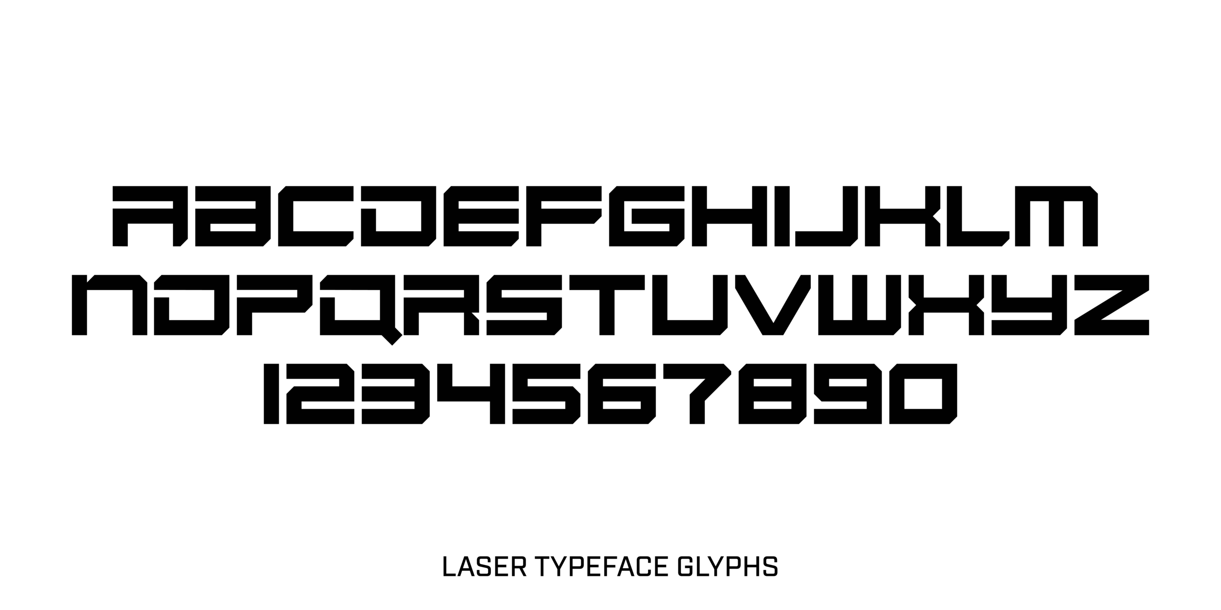
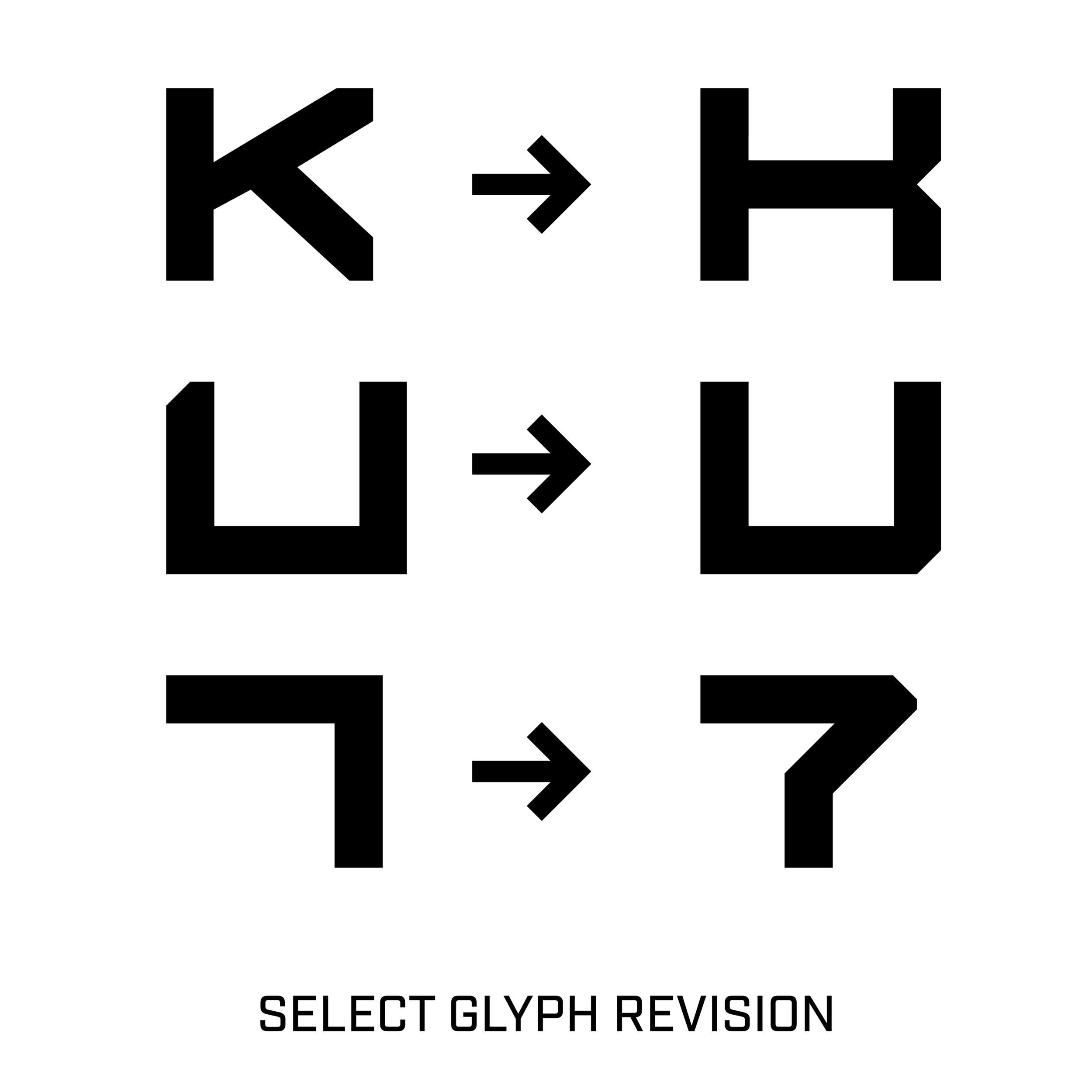
Finally, PLAE had an existing custom typeface, Laser, but it wasn’t a working font. I revised some of the letterforms to fit the face better, and turned it into a fully kerned live font.